
Elevate Your Space with the Perfect Color
Struggling to find art that fits your room's vibe? Learn the simple secrets to choosing the perfect print color that harmonizes with your decor and makes your space feel truly you. No more guesswork, just beautiful results.
A captivating photograph does more than just capture a moment—it transforms a space. A large print becomes the focal point, setting the mood and reflecting your personal style. It's about creating harmony and impact. The color tone of your print can dramatically influence the atmosphere of your room, making it feel expansive and serene, cozy and intimate, or vibrant and energetic.
Let's dive into how you can select a print that perfectly complements your home:
Analyze your room’s existing color palette, lighting, and desired mood.
Use warm-toned prints to create energy and intimacy.
Leverage cool-toned prints for a serene and spacious feel.
Incorporate versatile neutral and monochrome art for a timeless look.
Decide whether to harmonize with or contrast against your current decor.
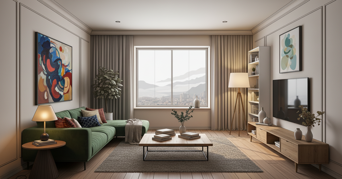
1. First, Understand Your Space
Before you start browsing, take a good look at the room. Consider the dominant colors in your furniture and on the walls. How much natural light does it receive? And most importantly, what feeling do you want to evoke? Is it a tranquil retreat, a lively gathering space, or a sophisticated dining area? Once you have a clear understanding of your room's baseline, you can start to think about how your print will integrate.
2. The Power of Warm Tones for Coziness
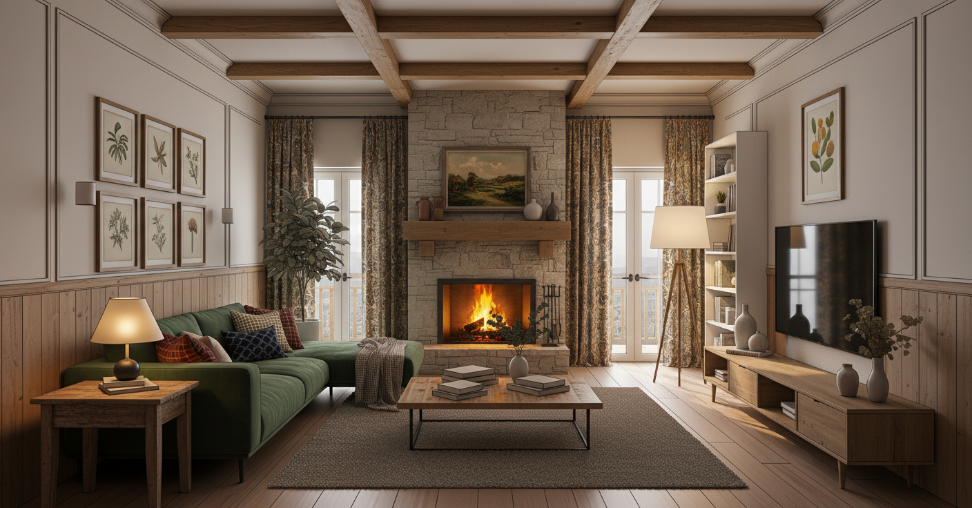
Warm-toned prints—those dominated by reds, oranges, and rich browns—instantly bring a sense of energy and intimacy. They're perfect for rooms where you want to encourage conversation and relaxation, like a cozy living room or an intimate dining area.
Warm colors can also visually "heat up" a cooler room, making it feel more welcoming. Think of fiery sunsets or golden autumn landscapes to create an inviting atmosphere.
3. The Serenity of Cool Tones for Calm
Cool-toned prints—featuring blues, greens, and cool grays—are excellent for creating a sense of tranquility and spaciousness. They often evoke feelings of peace and reflection, making them ideal for a relaxing living area. Because cool colors tend to recede visually, they can also make a smaller room feel larger and more open. A breathtaking image of a tranquil lake at dawn can introduce a profound sense of natural beauty.
4. The Versatility of Neutrals and Monochromes
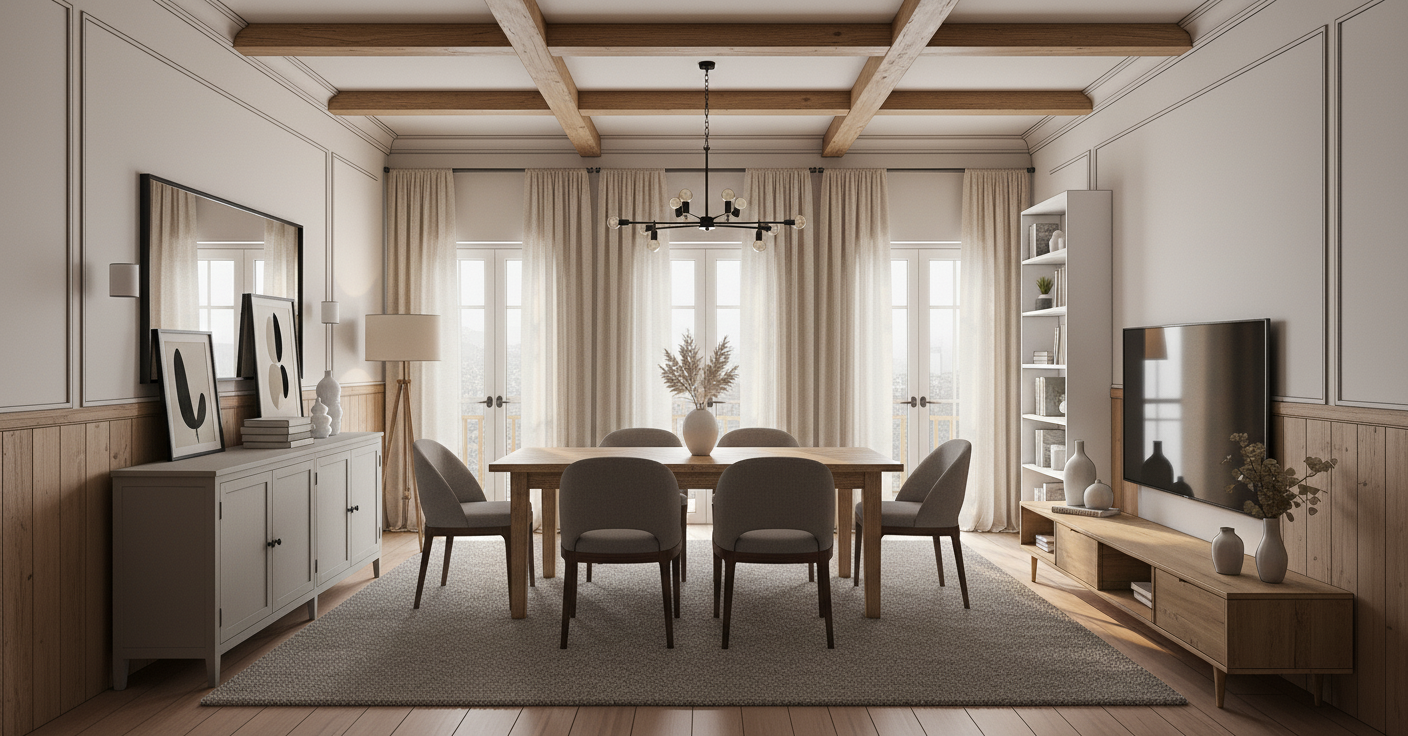
Prints with a neutral or monochromatic color scheme offer incredible sophistication. They blend seamlessly into almost any decor or provide a striking contrast.
A powerful black and white architectural shot offers depth and sophistication without introducing competing colors, allowing other elements of your room to shine. This style is perfect for modern interiors and offers a timeless elegance.
5. To Harmonize or Contrast? Your Final Choice
Once you've assessed your room, you have a fundamental decision: Harmonize by choosing a print that complements your room's existing palette for a cohesive look. Or, contrast by selecting a print that intentionally stands out to create a dynamic focal point. There's no single right answer; it all depends on the effect you wish to achieve.
Ready to find the perfect print? Explore the galleries to see how color can transform your space.
Other related blogs on this site:
Beyond the Blank Wall: A Simple Guide to Choosing Art for Your Home - Start with the basics of choosing art for any empty space.
Find the Perfect Photo Print: Art That Tells Your Story - Learn how to select art that reflects your personal journey.